Platform
What it looks like
Every screen here is the real product running one real analysis. The site is invented, a cross-dock in the East of England, and every figure is that run's own output rather than an illustration.
The site, and what it costs today
An analysis starts with the building. Its connection limit, its half-hourly consumption, and the tariff it buys electricity on. Consumption can be uploaded from a supplier export in whatever shape it arrives, or modelled from the building itself when there is no meter data to hand.
The worked example here is a 25,000 square metre cross-dock on a 1,000 kVA connection, open six days a week from 06:00 to 22:00, using 1,100 MWh a year and peaking at 605 kW. A thirty van fleet plugs in at 18:00 and leaves at 06:00, adding another 235 MWh.
The tariff, priced the way the bill is
A modern industrial bill is mostly not the unit rate. This one is a published UK distribution tariff with its red, amber and green network bands, the climate change levy, policy levies, a standing charge and a capacity charge, with the energy itself priced from the wholesale market rather than a fixed rate.
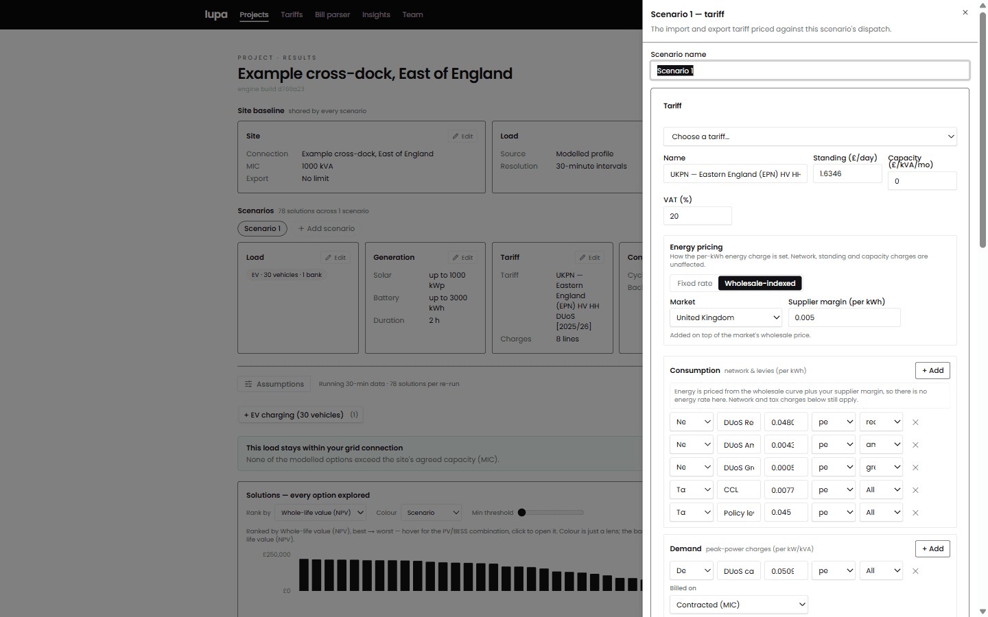
The bill parser reads an invoice and reconstructs these lines, reconciling them against the printed total before an analyst accepts them.
On this site and this tariff the electricity costs £225,566 a year, which is 16.9p a unit once every charge is counted. That number is what everything else is measured against.
Solar and storage, swept rather than guessed
Rooftop yield comes from the site's own location and roof geometry, or from a HelioScope export where one exists. Here it is 916 kWh per kWp, giving 916 MWh a year from a 1,000 kWp array.
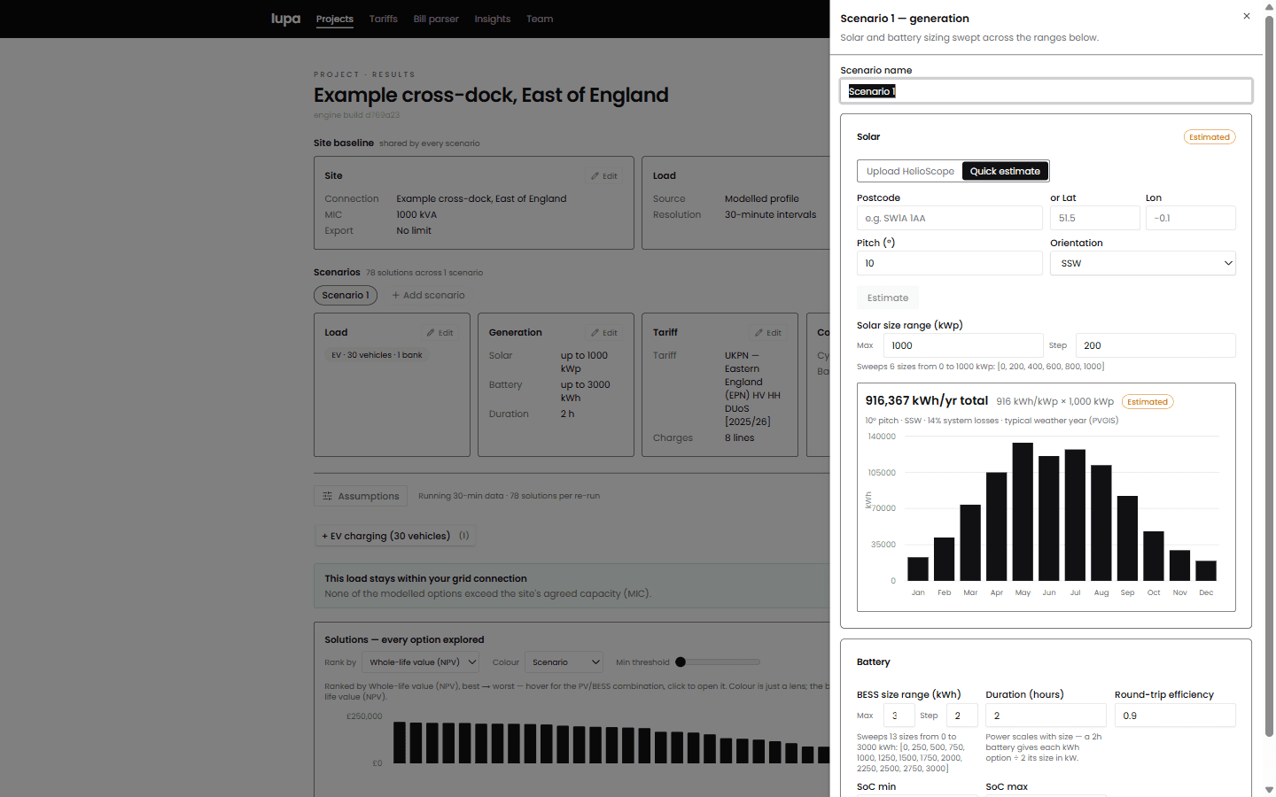
Six solar sizes and thirteen battery sizes, which is the 78 combinations solved on every run.
Rather than modelling one size and stopping, the platform solves every combination of solar and battery size across the ranges you set. Each one gets its own optimised year of half-hourly dispatch against the real tariff and the real connection limit.
Every option, ranked
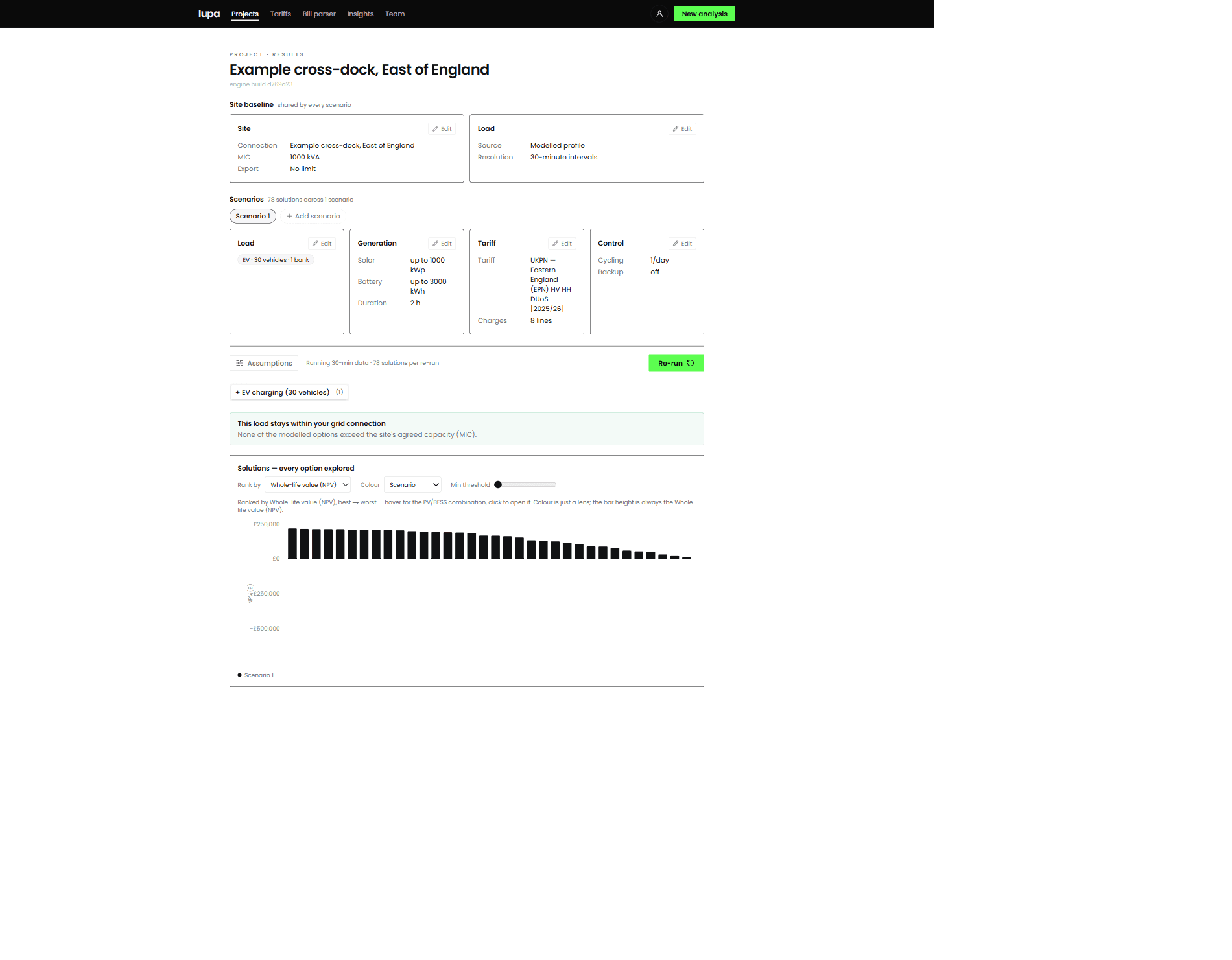
The 78 options for this site, best to worst. Clicking one opens its dispatch, its cashflow and its emissions.
The best option on this site is 800 kWp of solar with a 500 kWh battery, worth £216,000 over the project's life and paying for itself in 8.5 years. The next three are within a few thousand pounds of it, which is the more useful finding: there is rarely one obviously right answer, and knowing how flat the top of the range is tells you how much room you have to move on cost or roof space.
It also shows where the battery stops earning. Every good option here carries one, but a small one, 250 to 500 kWh on a site that could physically take 3,000. Past that the extra capacity costs more than it returns. Modelling a single size would have hidden that.
Inside one option
Opening an option gives its capital cost, its first year earnings, its payback, its return and its whole-life value, and then the working behind each of them. For the 800 kWp and 500 kWh option here that is £728,642 of capital, £85,611 in the first year, 8.5 years to pay back and an 11% return.
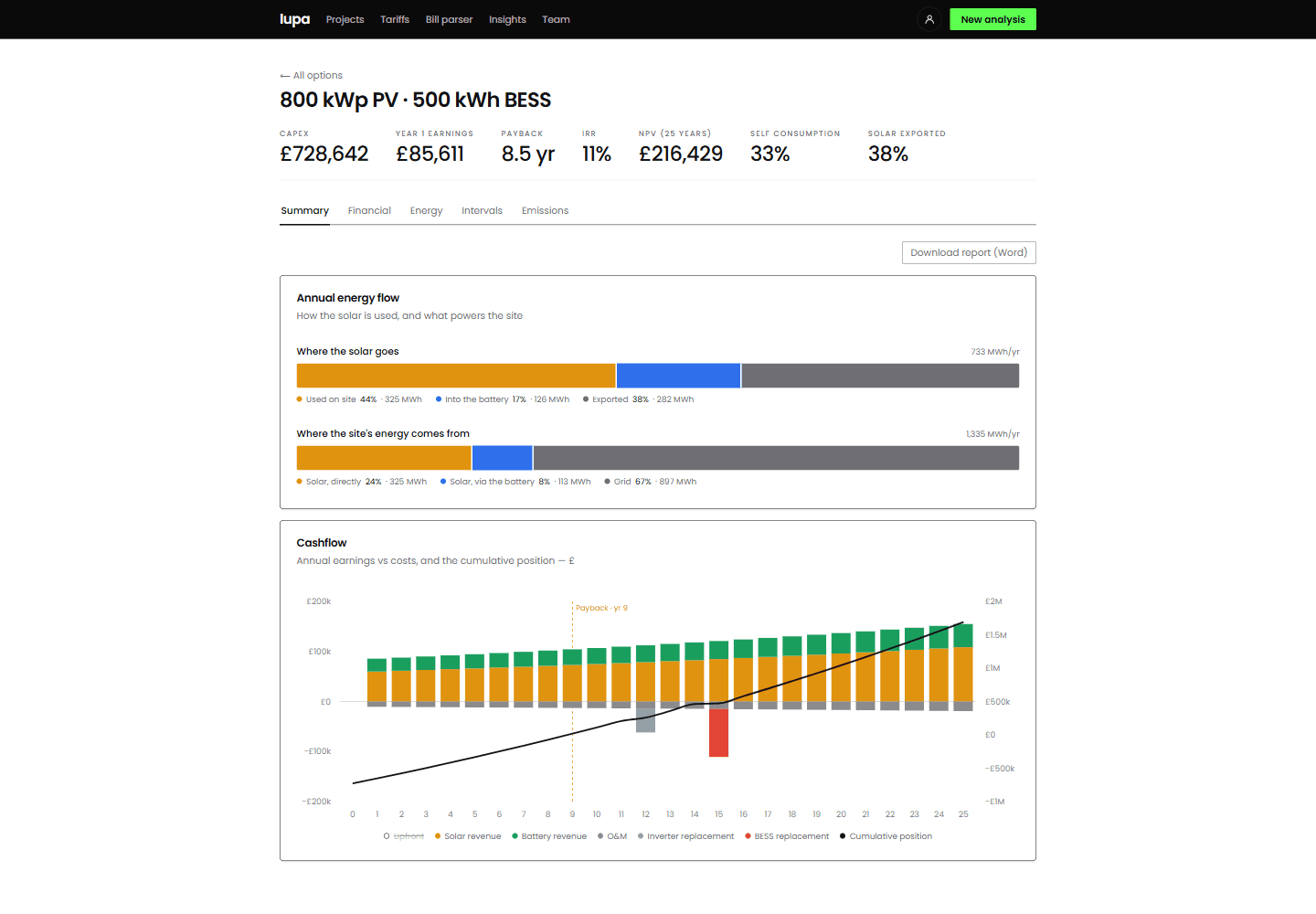
Where the solar goes, where the site's energy comes from, and the cashflow across twenty-five years with the payback year marked.
Of the 733 MWh this array generates, 44% is used on site as it is made, 17% goes through the battery and 38% is exported. Looked at from the building's side, a third of what it consumes now comes from its own roof.
Down to the half hour
The figures above are summaries of something the model actually computed interval by interval. Any day of the year can be opened and read directly.
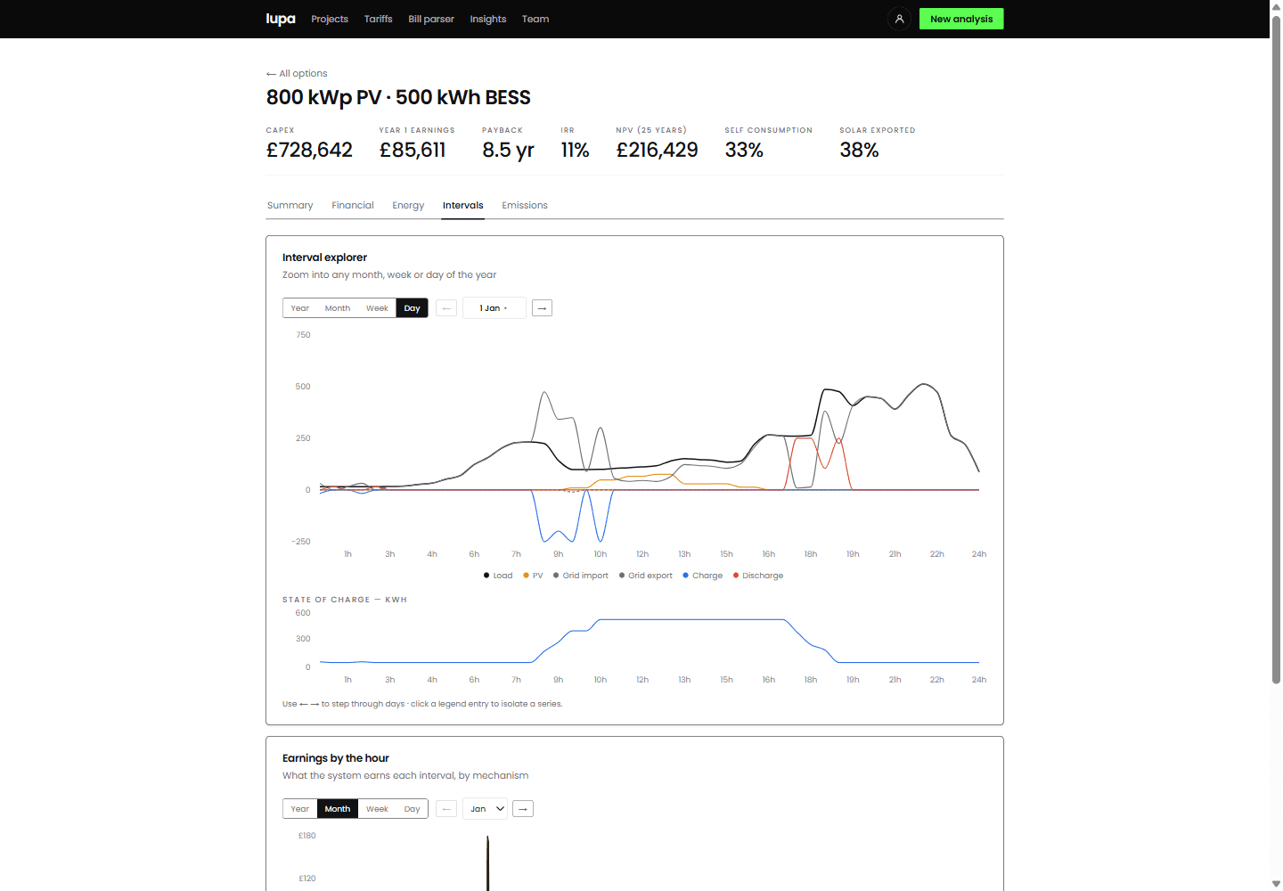
One day in January. The battery fills in the morning, holds, and discharges into the evening peak.
This is the part that cannot be done with annual averages. The battery earns its keep by being in the right half hour, and whether it is depends on the tariff, the solar and the shape of that particular day.
Carbon, on both bases
A UK company reports its electricity emissions using one published factor for the whole year. That figure has to be published and it is reported here. It also cannot see anything a battery does, because moving a unit of electricity from one half hour to another leaves the annual total unchanged.
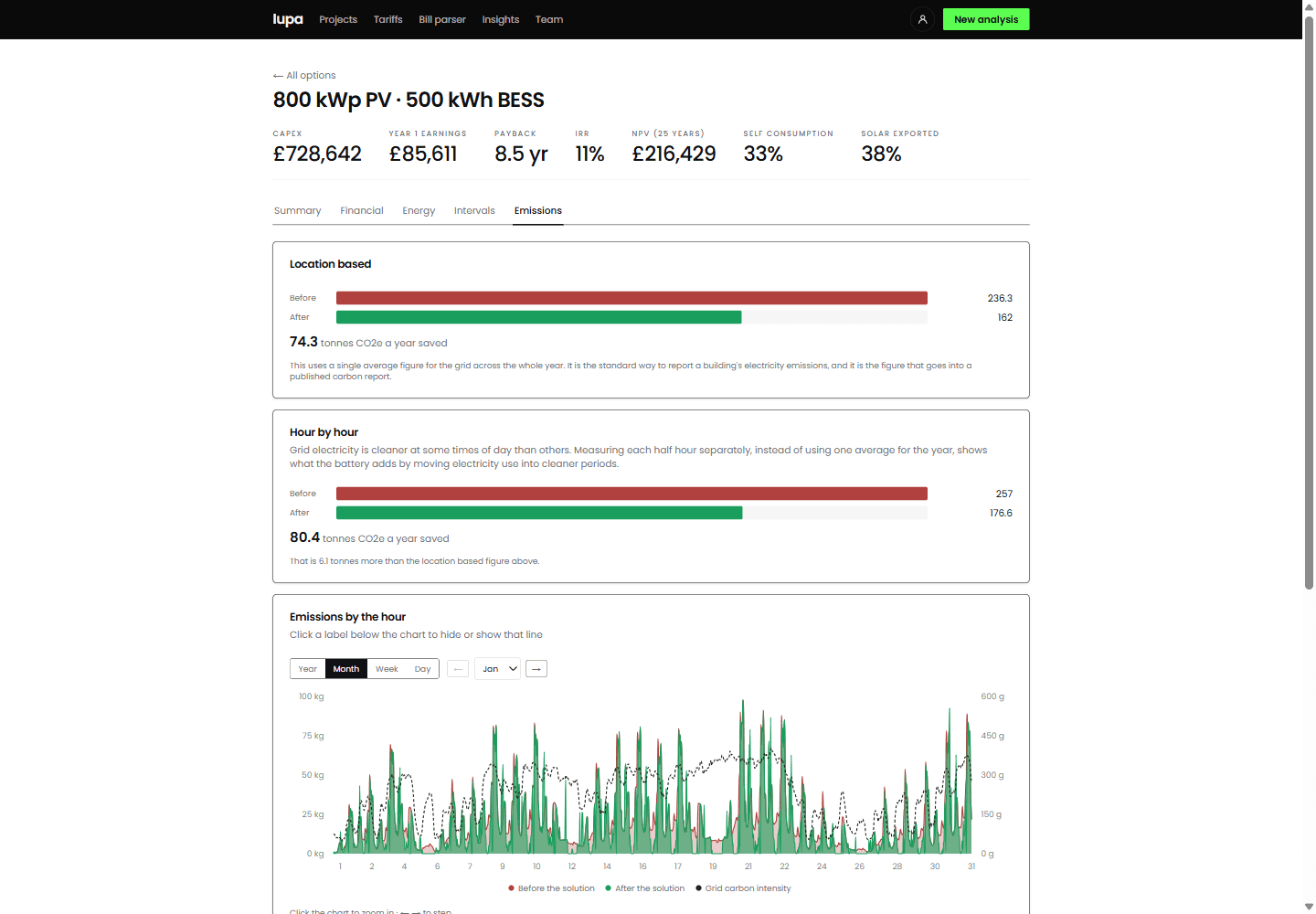
The same year measured both ways, with the difference between them stated.
Measured half hour by half hour against the grid's actual carbon intensity, this option saves 80.4 tonnes a year rather than 74.3. The 6.1 tonne difference is the part the annual factor cannot see, and it is there because the battery moves consumption into cleaner periods.
What comes out
A Word report a client can be sent, and an Excel workbook an analyst can defend line by line: the annual cashflows, the monthly energy, the half-hourly dispatch and the assumptions behind all of it.
Results carry their caveats with them. Dispatch is optimised with complete knowledge of the year, which no real controller has, so the figure presented as achievable has a discount applied and says so. Emissions are reported both on the statutory annual factor and on the measured half-hourly carbon intensity of the grid, which is the only one of the two that can see what a battery does. There is more on both in the insights.